When we deal with technology or user’s interfaces, a complication is something we are not surely seeking, but in the case of the Apple Watch, the connotation is just positive. The “complications” are in fact those monochrome or coloured elements, graphic or textual, which appear on your smartwatch face allowing useful information consultation: heart beat, daily appointments, weather forecast, outside temperature, etc…
Where does the term “complications” come from?
If you talk to a watchmaker or a watch enthusiast, you will find out that this word belongs to their vocabulary. The functioning of a traditional watch is complex by itself, therefore every function or indication beyond the simple time visualization – for example, day, date, lunar phases, chronometer – is called complication.
What does a “complication” represent for Apple Watch owners?
For those who own an Apple Watch, the complications represent the best way to check a vast amount of information at a single glance and, at the same time, have quick access to frequently-used applications. Some use it to monitor their health, others to relax at a particularly stressful moment or to check his favourite team scores.
And what if we added “business” complications to “personal ones”?
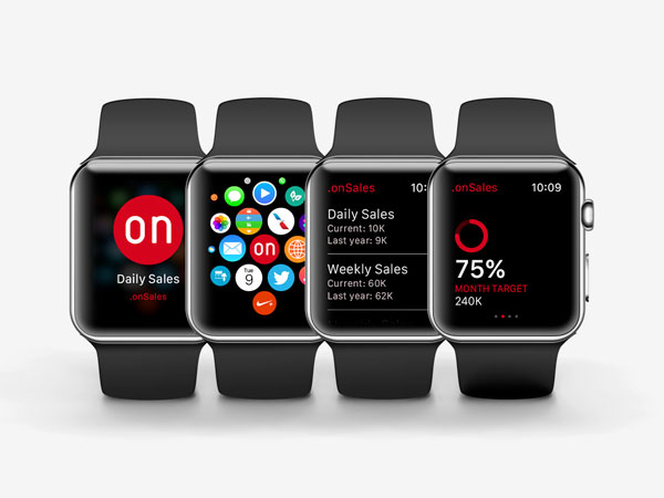
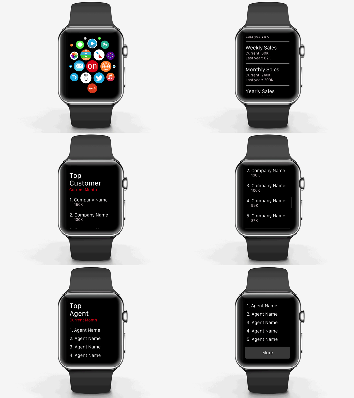
A Sales Director or Area Manager could visualize sales performance on his Apple Watch face, side by side with the latest sport results. By a single tap he could gain direct access to the sales app and consult sales statistics (daily, weekly, monthly.. compared to the same period of the previous year), his best customers and Sales reps’ rank, the target attainment percentage, etc…
Leisure & business could therefore blend into a single tool, within wrist’s reach!
